Creating spaces that cater to the sensory needs of autistic individuals is vital for their comfort, emotional well-being, and overall development. The role of color in designing autism-friendly spaces is crucial, influencing sensory experiences, emotional responses, and daily routines.
The Science of Color and Autism
Colors impact everyone differently, but for autistic individuals, the effects can be more pronounced due to sensory processing differences. Colors can evoke emotional responses, influence heart rate, and even affect behaviors. For example, cool colors like blue and green are often associated with calmness, while bright, intense hues can lead to sensory overload. Understanding these nuances is essential when creating sensory-friendly spaces.
How Sensory Sensitivities Impact Color Perception
Autistic individuals may experience greater intensity in sensory input, making them more susceptible to the effects of bright lights, intense colors, and highly saturated tones. Shorter wavelengths, such as those found in blues and greens, tend to have a calming effect, while intense colors like bright reds or yellows can overstimulate and trigger discomfort or anxiety.
The Role of Color Therapy
Color therapy, which uses specific hues to evoke desired emotional responses, is often applied in autism-friendly design. This approach emphasizes softer, muted tones to create a calming environment that supports emotional regulation and minimizes sensory overload.
Autism-Friendly Colors: The Best Choices
When selecting paint colors for a sensory-friendly space, focus on hues that align with the sensory needs of autistic individuals.
Cool Colors
Shades of blues, soft greens, and lavenders are excellent for reducing heart rate and promoting relaxation. For sensory bedrooms, these colors can help mitigate sleep issues by creating a serene atmosphere.
Pastel Tones
Soft pastel pinks, pale yellows, and muted peaches offer a similar effect. These tones are particularly effective in sensory rooms where the goal is to balance visual stimulation with comfort.
Neutral Tones
Light greys, beiges, and other neutral colors provide a versatile and understated backdrop. These tones are ideal for shared spaces like living rooms and dining areas, fostering inclusivity for both autistic and neurotypical family members.
Soft Orange Tones
Warm, gentle orange hues can encourage social interaction and warmth without overwhelming sensory sensitivities. This makes them a great choice for play areas or communal spaces.
What to Avoid in Autism-Friendly Design
While certain colors can be beneficial, others may lead to overstimulation or discomfort.
Bright Colors
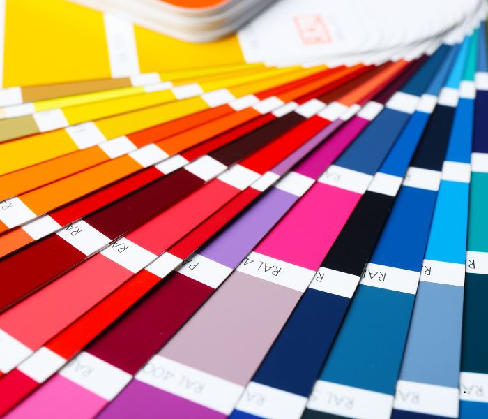
Highly saturated reds, yellows, and purples can evoke strong emotional responses and may lead to sensory overload. These should be avoided, particularly in spaces meant for relaxation.
Fluorescent Lighting and Bright Whites
Bright white walls, when paired with harsh fluorescent lights, can reflect too much light and strain the eyes. Opt for warmer, dimmable lighting solutions instead.
Bold Contrasting Patterns
High-contrast patterns or intense visual stimulation can distract or agitate autistic users. Solid or subtly textured surfaces work better in most autism-friendly spaces.
Case Studies and Real-World Examples
Transforming a Sensory Bedroom
A case study of an autism-friendly bedroom demonstrates how thoughtful color choices and sensory-friendly elements can make a profound difference. The room incorporated pale blue walls, soft pink accents, and natural light filtering through muted curtains. Additional features, such as a weighted blanket and bubble tubes, enhanced the sensory experience while fostering a calming effect.
Parental Insights
One parent shared their experience of using pastel tones and neutral colors to create a sensory den for their child. The result was a space that encouraged relaxation and reduced behavioral challenges, highlighting the significant impact of small changes.
Designing Autism-Friendly Spaces Beyond Bedrooms
The principles of autism-friendly design extend to other parts of the home and even public spaces.
Sensory Dens
These are safe spaces for relaxation and sensory exploration. Use muted tones and incorporate tactile elements like soft cushions and textured rugs to complement calming colors.
Play Areas
Play areas benefit from warm, soft colors that balance stimulation and comfort. Adding natural light and visual supports can enhance the experience.
Healthcare and Community Spaces
Autism-friendly designs in healthcare facilities, schools, and public spaces often utilize neutral tones and adjustable lighting. These changes create inclusive environments that respect the sensory needs of all individuals.
Beyond Color: Additional Sensory-Friendly Design Tips
Color is just one aspect of creating a sensory-friendly environment. Other considerations include:
Lighting
Natural light is ideal, but artificial lighting should be soft and adjustable. Avoid harsh, bright lights that can contribute to sensory overload.
Textures and Materials
Introduce tactile elements, such as soft fabrics or smooth surfaces, to create a well-rounded sensory experience.
Visual Supports
Incorporate organizational tools like labeled drawers, color-coded bins, or picture boards to help autistic individuals navigate their space with ease.
Sound Dampening
Use sound-absorbing materials like thick curtains, carpets, or acoustic panels to reduce loud noises and create a quieter environment.
Tips for Parents and Caregivers
Involving your child in the design process can lead to better outcomes. Here are a few practical steps:
- Test Colors: Apply sample paints to small areas to see how your child responds to different shades.
- Prioritize Flexibility: Use removable wall decals or temporary wallpaper to adapt the space as your child’s preferences evolve.
- Consider Their Favorite Color: If your child has a preferred hue, incorporate it in muted tones to provide comfort and familiarity.
The Impact of Color Choices on Daily Life
Thoughtful room colors can have a significant impact on an autistic individual’s daily routines and overall well-being. From improving sleep issues to supporting emotional regulation, the right colors contribute to a more supportive environment.
Conclusion
Designing spaces for autistic individuals is about more than aesthetics—meeting specific sensory needs and creating safe, calming environments. By choosing autism-friendly colors, parents, caregivers, and designers can make profound changes that enhance emotional well-being and foster good behaviors. A fresh coat of paint, when paired with a deep understanding of sensory needs, can transform any space into a haven for autistic individuals and their families.